 Image above came from this website.
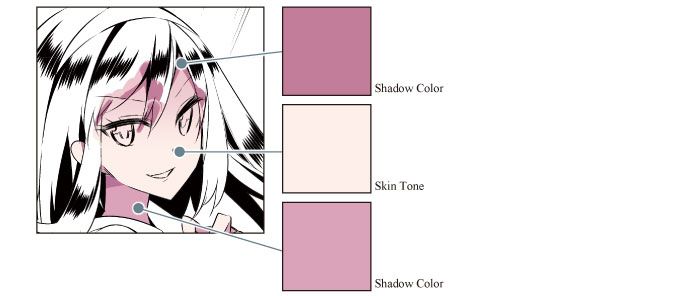 Information above came from this website.
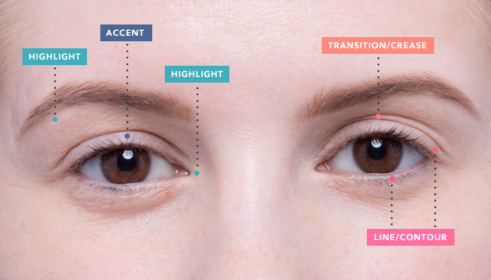 Information above came from this website.
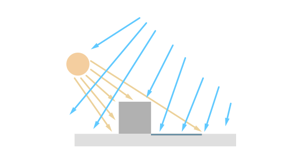 Information above came from this website.
Lighter pressure is the usual go-to because it makes a better base for layering colors, but the best way to feel it out is to make a pressure scale. Draw swatches of the same color using different pressures and you'll quickly see the difference. Then you can refer to your scale as your work on your piece. Little tip from creator: just to suggest people who wanted to learn about coloring, based on my experience, the position of light and shadow is something you guys should really work on.
Information above came from this website.We don't see blue objects everywhere around us though, instead we see what's called "local color" . Local color refers to the actual color of the object. A red apple's local color is red. There may some other colors on the apple like yellow, white, or green. Local color includes those colors as well. It's generally what your eye sees on an object. Tints of local color are mostly created by adding white to the color, while shades of the local color are created by adding black to the color.
Information above came from this website. Image above came from this website.
 Information above came from this website.
 Information above came from this website.
 Information above came from this website.